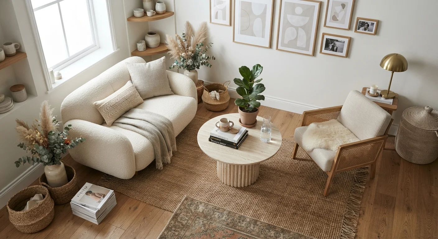
Why Design Vocabulary Matters
Interior design has its own language, and not knowing it can leave you guessing when a designer references your room's sightline or suggests adding more visual weight to a corner. This glossary demystifies the terms professionals use most — so you can participate confidently in any design conversation, whether you're hiring a decorator, watching a renovation show, or planning a room refresh on your own.
If you're just beginning to explore how rooms come together, our ground-up introduction to interior design covers foundational concepts in plain language. The terms below build on that foundation.
Sightline
The unobstructed visual path from one point in a room to another. Designers use sightlines to control first impressions and guide the eye through a space.
Visual weight
The perceived heaviness of an object based on its color, size, texture, and density — not its physical mass. Darker and denser objects carry more visual weight than light, airy ones.
Juxtaposition
The intentional placement of contrasting elements — rough and smooth, old and new, matte and glossy — side by side to create visual interest and depth.
Negative space
Deliberately empty areas in a room that give the eye a place to rest. Negative space prevents clutter and allows featured objects to stand out.
Saturation
The intensity or purity of a color. High saturation produces vivid, bold tones; low saturation produces dusty, muted ones.
Biophilic design
A design philosophy that integrates natural elements — plants, wood, stone, daylight — into interior spaces to foster a sense of connection with the natural world.
Focal point
The dominant visual element that draws the eye first when entering a room. A strong focal point gives a space a clear sense of intention and hierarchy.
Circulation
The pathways people use to move through a room or home. Adequate circulation clearance — typically 30 to 36 inches in main paths — is essential for both comfort and safety.
Spatial and Layout Terms
How a room is organized in physical space shapes everything else. These terms describe the logic behind layout decisions.
- Sightline
- The unobstructed visual path from one point in a room to another. Designers think carefully about what you see the moment you enter a space — a cluttered sightline can make even a large room feel chaotic.
- Circulation
- The pathways people use to move through a space. Good circulation means no awkward squeezing past furniture; most designers aim for at least 30–36 inches of clearance in main traffic paths.
- Focal point
- The element that draws the eye first when you enter a room — often a fireplace, a large piece of art, or a statement sofa. Every well-designed room benefits from at least one intentional focal point. See our article on furniture arrangement principles for more on how focal points anchor a room.
- Negative space
- The deliberately empty areas of a room. Negative space gives the eye a place to rest and prevents a room from feeling overstuffed.
| Minimum main traffic clearance | 30–36 inches (Common professional guideline) |
| Elements that create visual weight | Color, texture, size, density |
| Balance types in interior design | Symmetrical, asymmetrical, radial |
| What VOC stands for | Volatile Organic Compounds (U.S. Environmental Protection Agency (EPA)) |
| Hue variations | Tint (+ white), shade (+ black), tone (+ gray) |
| Key goal of biophilic design | Connect interior spaces to nature |
Visual Balance and Proportion
These terms describe how elements relate to one another in weight, size, and feel — the invisible math that makes a room look right.
- Visual weight
- The perceived heaviness of an object based on its size, color, texture, and pattern — not its actual mass. A dark velvet chair carries more visual weight than a transparent acrylic side table of the same size.
- Scale
- The size of an object relative to the room and to other objects in it. A small rug under a large sectional looks out of scale; a lamp that towers over a petite end table does too.
- Symmetrical balance
- Mirroring elements on either side of a central axis — for example, matching nightstands and lamps flanking a bed. It reads as formal and orderly.
- Asymmetrical balance
- Achieving visual equilibrium without identical elements. A large painting on one side might be balanced by a cluster of smaller objects on the other. This approach typically feels more casual and dynamic.
- Proportion
- The relationship between parts of a single object or composition. Furniture with good proportion looks harmonious rather than stubby, stretched, or awkward.
Many common misconceptions about these principles are addressed in our look at interior design myths that keep rooms looking off.
Color, Texture, and Material Terms
Color and texture are the sensory layer of design. Understanding a few key terms makes paint and material choices far less overwhelming.
- Hue
- The pure color family — red, blue, green, yellow. Hue is the starting point before any lightening, darkening, or graying is applied.
- Tint, shade, and tone
- Variations of a hue. Adding white creates a tint (softer, lighter); adding black creates a shade (darker, moodier); adding gray creates a tone (more muted and sophisticated).
- Saturation
- The intensity or purity of a color. Highly saturated colors are vivid and bold; desaturated colors appear dusty or muted — think terracotta versus neon orange.
- Juxtaposition
- Placing contrasting elements side by side for deliberate effect — rough next to smooth, matte next to glossy, rustic next to refined. Juxtaposition creates visual tension that keeps a room from looking flat.
- VOC
- Volatile Organic Compounds — chemicals that off-gas from paints and finishes. Low-VOC products are generally considered preferable for indoor air quality. Our guide to reading a paint tin explains what finish and VOC labels actually mean.
Design Terms Vary by Context
Some terms — like 'tone,' 'style,' and even 'balance' — are used loosely in everyday conversation but carry more precise meanings in professional design practice. When working with a designer or reading trade publications, pay attention to how words are used in context. If you're ever unsure, asking for clarification is always appropriate and appreciated by good professionals.
Style and Concept Terms
These broader terms describe how individual design choices add up to a coherent aesthetic direction.
- Design vernacular
- The visual language specific to a style, region, or period — the recurring shapes, materials, and motifs that make a room identifiably Scandinavian, Mediterranean, or mid-century modern. Our overview of global interior design styles explores the vernacular of major movements.
- Biophilic design
- An approach that incorporates natural elements — plants, wood, stone, natural light, water features — to strengthen the connection between indoor spaces and the natural world.
- Layering
- Building up visual richness by combining multiple textures, patterns, and materials rather than relying on a single statement piece. A layered room feels curated and lived-in rather than showroom-stiff.
- Cohesion
- The quality of a room where every element feels intentionally related to the whole. Cohesion doesn't require matching everything — it requires that choices share something in common, whether that's color family, material, or mood.
Sustainability-focused design introduces its own vocabulary around reclaimed materials and low-impact finishes — explored in depth in our article on sustainable interior design.