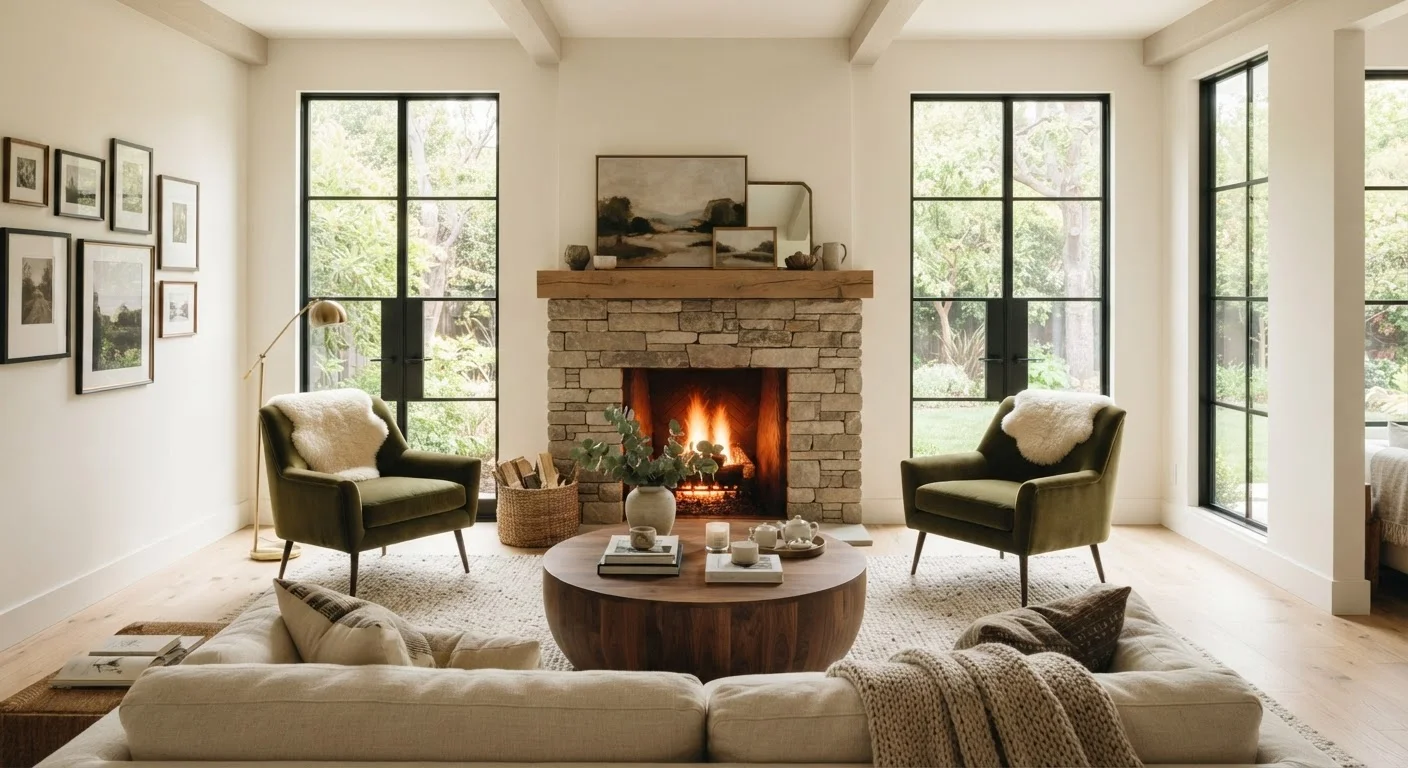
Start with a Focal Point
Professional designers typically begin every layout with one question: what is this room's focal point? A focal point is the visual anchor that draws the eye upon entering — a fireplace, a large window with a view, a prominent piece of art, or even a well-positioned media unit. Once identified, all major seating is oriented toward it.
This principle prevents the common mistake of pushing furniture against every wall and leaving the center of the room empty. Instead, furniture faces inward toward the focal point, creating a sense of purpose and cohesion. If your room lacks an obvious architectural feature, a large mirror, a gallery wall, or a bold area rug can serve the same anchoring role. For a deeper look at the vocabulary behind these concepts, see our plain-language interior design glossary.
Identify and orient your layout around a single focal point before placing any furniture.
Without a focal point, seating often ends up scattered with no visual logic, making a room feel restless and hard to use. Anchoring the arrangement gives every piece a clear relational purpose.
Maintain at least 36 inches of clearance on primary traffic paths through the room.
Narrow walkways create daily friction and make a space feel cluttered regardless of how few items it contains. Adequate clearance supports easy movement and signals visual openness.
Keep seating within a conversation zone no wider than 8 feet across.
When chairs sit too far apart, occupants raise their voices or disengage entirely, undermining the social function of a living space. Tight, purposeful groupings encourage natural interaction.
Float key pieces — especially sofas — away from the wall by at least 12 inches.
Pushing all furniture against walls creates a hollow center and a perimeter-hugging effect that reads as uncertain or unfinished. A floated arrangement signals intentionality and creates zones within the room.
Balance visual weight across the room rather than clustering heaviness on one side.
A lopsided layout — one massive piece on the left, nothing substantial on the right — creates visual tension that feels uncomfortable even if readers can't articulate why. Distributing mass creates calm.
Design for Conversation and Clearance
Once the focal point is set, designers define conversation zones — clusters of seating close enough for people to talk comfortably without raising their voices. A general guideline is to keep facing seats within about 8 feet of each other. Beyond that distance, a natural conversational exchange becomes effortful.
18"
Ideal sofa-to-coffee-table clearance
Interior design guidelines widely recommend 16–18 inches between a sofa and coffee table for comfortable reach and easy movement.
36"
Minimum primary walkway width
Building accessibility standards and design professionals both cite 36 inches as the practical minimum for comfortable passage through main living areas.
Equally important are clearance distances. Leaving roughly 18 inches between a sofa and a coffee table allows people to reach forward easily and stand without bumping their shins. Main walkways through a room ideally measure at least 36 inches wide; secondary paths can be a bit narrower at around 24 inches. These numbers aren't arbitrary — they reflect the average width of a person walking comfortably and carrying everyday items.
If your room feels perpetually cluttered despite minimal furniture, clearance issues are often the culprit. Rooms that seem too small for their contents sometimes just need a furniture edit. Our article on why small rooms feel even smaller explores related spatial principles in depth.
Use Tape Before You Lift Anything
Before rearranging heavy furniture, use painter's tape on the floor to map out proposed piece positions. Walk through the layout for a day or two to test clearance and traffic flow. This simple step can prevent multiple exhausting rearrangements and protect both your floors and your back.
Float Furniture and Balance the Room
One of the most counterintuitive lessons from professional designers is to pull furniture away from the walls. Floating a sofa even 12–18 inches into the room creates a more intimate grouping and paradoxically makes the room feel larger by allowing visual breathing room around the perimeter.
Balance matters just as much as position. Designers think in terms of visual weight — the sense of heaviness a piece carries based on its size, color, and material. A large sectional on one side of a room may need to be balanced by a substantial bookcase or pair of armchairs on the opposite side, rather than a single lightweight accent chair. This doesn't require perfect symmetry; asymmetrical balance, achieved by grouping several smaller pieces to offset one large one, is a widely used technique that keeps rooms feeling dynamic rather than stiff.
These same principles extend outdoors — our guide to designing an outdoor space you'll actually use all season applies similar traffic flow and zone-planning ideas to patios and garden rooms. For those weighing bigger structural decisions, open-plan vs. defined rooms examines how floor plan type shapes every layout choice you'll make.