Why Design Myths Persist
Interior design advice travels fast — from shelter magazines to social media feeds to well-meaning friends — and certain rules get repeated so often they start to feel like physics. In reality, most of them are simplifications that made partial sense in a specific context and were then applied universally. The result is rooms that feel cautious, flat, or just slightly wrong, without the homeowner being able to pinpoint why.
Understanding why a guideline exists is far more useful than memorizing it. If you know that the "always paint small rooms white" rule was a response to the limited lighting of older homes, you can make a smarter call in your own space. Our introduction to interior design fundamentals covers the underlying principles — scale, balance, light — that make these judgment calls possible.
The myth-fact pairs below address the misconceptions we encounter most often, each one corrected with the reasoning that actually holds up.
Myth
Dark paint makes a room feel smaller and should be avoided in compact spaces.
Fact
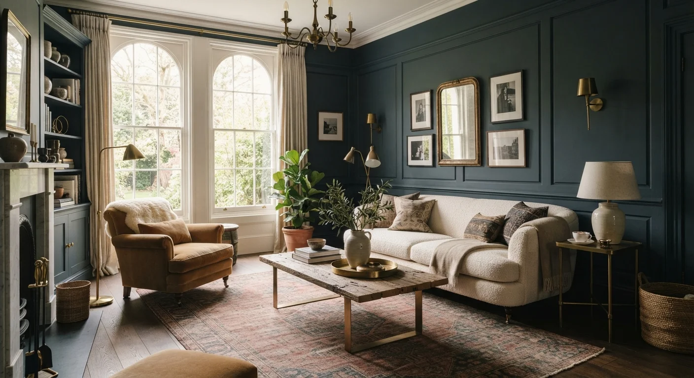
Dark paint can actually make a room feel more enveloped and intentional; it's poor lighting and low sheen, not color depth, that genuinely compress a space.
This rule likely originated when artificial lighting was dim and rooms relied heavily on reflected daylight. In those conditions, a dark wall absorbed light that the room couldn't afford to lose. In a well-lit modern interior, a deep navy, charcoal, or forest green can create a sense of depth and atmosphere that makes a small room feel considered rather than cramped.
What actually shrinks a room visually is a mismatch between wall color and trim color that chops up the sightlines, combined with flat or matte finishes that swallow light unevenly. If you want to explore this further, our piece on why small rooms feel smaller explains the spatial illusions at play.
Myth
All metals in a room should match — brass fixtures require brass hardware and frames.
Fact
Mixing metals is a widely used professional technique; the key is intentional contrast and repetition, not uniformity.
Matching every metal in a room to a single finish is a relatively recent and fairly rigid convention. Designers routinely combine warm metals (brass, gold, bronze) with cool ones (chrome, nickel, matte black) because the contrast adds visual interest and makes a space feel less like a showroom.
The guideline that does hold up is repetition: whatever metals you use, let each one appear at least twice in the room so the combination reads as deliberate rather than accidental. A brass pendant paired with a brass mirror, set against matte black cabinet pulls, works precisely because each finish recurs.
Myth
Furniture in a small room should be small — oversized pieces overwhelm compact spaces.
Fact
One appropriately scaled anchor piece typically serves a small room better than multiple small pieces fighting for visual territory.
Filling a small room with diminutive furniture creates clutter, interrupts sightlines, and paradoxically makes the space feel busier and smaller. A single well-proportioned sofa or dining table — sized to the room's footprint, not its square footage — gives the eye a clear focal point and leaves breathing room around it.
The principle to follow is clearance: ensure traffic paths remain at least 30–36 inches wide and that the room's focal point (fireplace, window, media wall) can be read without furniture blocking the view to it. Our article on furniture arrangement principles covers clearance rules in detail.
Myth
Ceilings should always be painted white to make them recede and the room feel taller.
Fact
Ceiling color choices depend on the effect you want — a white ceiling raises perceived height, but a colored ceiling can add intimacy, drama, or cohesion depending on the space.
White ceilings do tend to push the eye upward, which is useful in low-ceilinged rooms. But treating this as an absolute rule produces boxy, unfinished-looking spaces where the ceiling feels disconnected from the rest of the design. Painting a ceiling the same color as the walls — or even a shade darker — can make a room feel intentional and complete rather than unfinished. In tall-ceilinged spaces, a deeper ceiling tone actually brings the room into a more comfortable human scale.
Consider the logic behind statement walls alongside ceiling decisions — both surfaces affect how enclosed and grounded a room feels.
Myth
Every room needs a consistent style — mixing periods or aesthetics looks chaotic.
Fact
A room composed entirely of matching-period pieces tends to look staged; deliberate mixing of styles creates the layered, lived-in quality that makes interiors feel authentic.
The instinct to buy a matched bedroom set or furnish entirely in one aesthetic comes partly from how furniture is sold and partly from a fear of getting it wrong. But rooms that read as genuinely comfortable almost always contain items from different periods, materials, and origins that share some unifying element — a repeated color, a consistent level of formality, or a common material like wood or linen.
The operative word is deliberate. Contrast that is controlled — a mid-century lamp on a traditional side table, united by a warm wood tone — reads as curated. Contrast that is accidental — pieces of mismatched scale and color thrown together — reads as unfinished. Our overview of minimalist vs. maximalist design explores how opposing philosophies each manage this tension differently.
Applying Corrected Principles in Practice
Debunking a myth is only half the work. Putting the accurate principle into action requires understanding your room's specific fixed elements — its natural light sources, ceiling height, existing architectural details, and traffic patterns. Before repainting, rearranging, or purchasing, it pays to do a structured assessment. Our room assessment checklist walks through exactly that process.
Scale is the area where corrected thinking pays off most visibly. Undersized rugs and curtains hung too close to the window frame are two of the most common errors — and both stem from myths about what looks "proportionate" in a small space. Our guide to rug and curtain sizing breaks down the numbers and the reasoning.
30–36 in
Recommended minimum furniture clearance width
Interior design professionals generally recommend at least 30 to 36 inches of clear walkway in main traffic paths to maintain comfortable movement through a room.
2×
Minimum repetitions for mixed metals to read as intentional
Design educators commonly advise that each metal finish in a room appear at least twice so the combination looks curated rather than mismatched.
Lighting is another area where misconceptions run deep. The belief that artificial lighting can simply replicate daylight — and therefore that a room's design only needs to account for one or the other — leads to interiors that feel off in the evening or harsh in the morning. Our article on natural versus artificial light addresses how to plan for both. Similarly, color theory applied room by room explains how hue and tone interact with light in ways that simple paint-chip comparisons miss entirely.
Design works best when rules serve as starting points for observation, not substitutes for it. Test ideas in your actual space, in your actual light, before committing — and trust what you see over what you've been told you should see.
Test Paint Colors in Your Actual Space
Paint chips and digital swatches look dramatically different under different light conditions. Always apply a large test patch — at least 12 by 12 inches — and observe it at multiple times of day and under your room's artificial lighting before committing to a full paint job. What reads as a soft gray in the store may appear lavender or green on your specific walls.