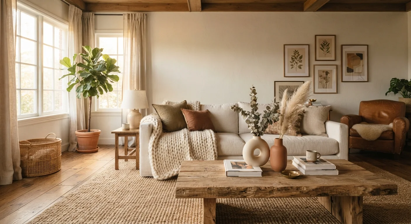
Why Texture Is the Missing Piece in So Many Rooms
Walk into a room that looks polished in photographs but feels oddly cold or flat in person, and the culprit is almost always the same: a lack of textural variety. Homeowners routinely focus on paint colors, furniture shapes, and lighting — all important — while overlooking the tactile dimension that makes a space feel genuinely livable.
Texture is one of the core elements of interior design, as foundational as color or scale. It determines how light moves across surfaces, how cozy a seating area feels, and whether a room reads as calm or energetic. When you understand how texture works, you gain one of the most versatile tools available for transforming any space. For a broader grounding in design vocabulary, see our plain-language guide to interior design terms.
90%
Of sensory experience is visual
Researchers in environmental psychology consistently note that visual impressions, including surface quality and texture, account for the vast majority of how we perceive and emotionally respond to interior spaces.
3–5
Texture types recommended per room
Interior design educators and professional decorators commonly advise using between three and five distinct textures in a single room to achieve balance between variety and visual cohesion.
The Two Types of Texture: Tactile and Visual
Understanding the distinction between these two types helps you use both intentionally.
- Tactile texture is physical — the roughness of a jute rug underfoot, the smoothness of a marble surface, the softness of a chenille cushion. These surfaces engage your sense of touch as well as sight.
- Visual texture refers to surfaces that appear textured but are essentially flat — a grasscloth wallpaper, a printed linen-look fabric, or a photograph of exposed brick used as a tile design. The eye reads these as textured even without physical depth.
Both types carry equal design weight. A room can feel richly layered using primarily visual texture, which makes this a practical option for renters or those working with lower budgets. The goal is to ensure the eye has varied surfaces to travel across, creating interest and dimension.
Start With What You Can Touch
When experimenting with texture, begin with soft furnishings you can swap easily: cushion covers, throws, and small rugs. These low-commitment additions let you test combinations before investing in permanent changes like wallpaper or new upholstery. Once you identify which contrasts feel right in your space, you can scale up with confidence.
How Contrast Between Textures Creates Depth
The real magic of texture lies not in any single material, but in the contrast between them. A smooth leather sofa feels more refined when paired with a rough linen cushion. A polished concrete floor becomes inviting with a thick, hand-woven wool rug layered on top. Reflective surfaces — glass, lacquered wood, metallic accents — gain impact when surrounded by matte or porous materials that absorb light.
This principle of contrast mirrors what color theory teaches about hue and tone. Just as warm and cool colors define each other through opposition, rough and smooth textures give each other context. Our article on how color contrast shapes a space explores the same principle applied to palette — and the two concepts work powerfully together.
Practical Ways to Layer Texture in Any Room
Textural layering does not require renovation. In most rooms, meaningful change can come from the following categories:
- Soft furnishings: Cushions, throws, and upholstery are your most flexible tools. Mix materials — velvet, boucle, linen, cotton — rather than defaulting to one fabric type throughout.
- Floor coverings: Area rugs introduce tactile texture at the largest horizontal surface in a room. Layering a smaller sheepskin over a flat-woven rug adds dimension without clutter.
- Window treatments: Sheer linen panels read very differently from heavy velvet drapes, even in similar colors. The weight and weave of fabric changes how a room feels.
- Wall treatments: Limewash paint, board-and-batten paneling, and grasscloth wallpaper all introduce visual or tactile texture without structural changes.
- Natural materials: Rattan, raw wood, woven baskets, stone, and ceramics each bring organic texture that tends to feel grounding. These materials also often align with sustainable design principles when sourced responsibly.
Texture layering is especially effective for addressing rooms that feel smaller than they should. Smooth, reflective surfaces open a space visually, while softer, denser textures draw a room inward and create intimacy — a principle covered thoroughly in our guide to why small rooms feel even smaller.
“Texture is what gives a room its soul. Color and furniture create the structure, but it is the varied surfaces — the rough against the smooth, the matte beside the reflective — that make people want to stay.”
— Interior Design Education Council, Professional development body for interior design educators
Avoiding Common Texture Mistakes
More texture is not always better. A few common pitfalls are worth knowing:
- Monotexture rooms: Spaces furnished entirely in smooth, flat materials feel sterile. This is especially common in modern or minimalist rooms where the impulse toward simplicity strips out all surface variation.
- Texture overload: Conversely, combining too many competing textures — rough stone, heavily patterned fabric, metallic tiles, and shaggy rugs all at once — creates visual noise. Aim for variety within limits: two or three dominant textures with supporting accents.
- Ignoring scale: A large, chunky-knit throw belongs in a generously sized room; the same piece can overwhelm a small bedroom. Match the scale of textural elements to the proportions of the space.
Some of these tendencies are reinforced by persistent design myths — the idea that everything must match, for example, discourages the deliberate contrasts that make texture work. Our guide to common interior design myths addresses several of these misconceptions directly.