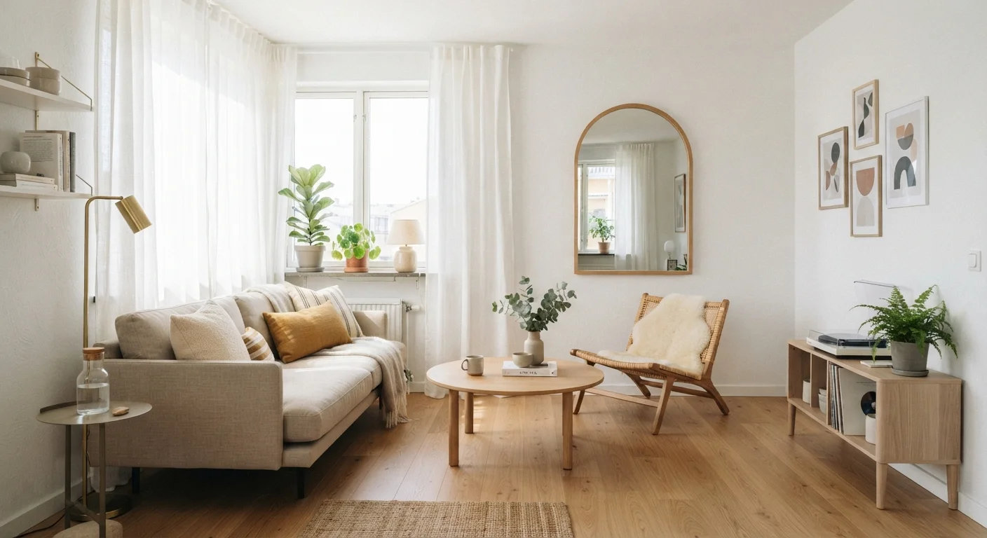
What Makes a Room Feel Smaller Than It Is
Square footage tells only part of the story. A 200-square-foot studio can feel open and calm or crushingly tight — and the difference usually comes down to how the space is designed, not how big it actually is.
Several factors conspire to shrink perceived space. Visual clutter is the most immediate: when the eye has nowhere to rest, the brain registers the room as chaotic and compressed. Poor lighting collapses depth — shadows erase the far corners of a room, making walls feel closer than they are. Mismatched furniture scale distorts proportion; one piece that is too large for the room makes everything around it feel crowded.
Colour contrast also plays a role. Stark contrasts between walls, ceiling, and floor break the room into competing zones. A room where every surface reads as a separate element feels fragmented and smaller. Conversely, a tonal palette — where wall, ceiling, and trim shades relate to one another — reads as a single unified volume, which the brain interprets as more spacious.
Assess Before You Redecorate
Before redesigning a small room, it helps to assess your existing fixed elements — window placement, ceiling height, and traffic flow — so that your design choices work with the architecture rather than against it. See our room assessment checklist for a structured starting point.
Before redesigning a small room, it helps to assess your existing fixed elements — window placement, ceiling height, and traffic flow — so that your design choices work with the architecture rather than against it. See our room assessment checklist for a structured starting point.
Colour and Tone: Using the Palette to Expand Space
Light, cool tones — soft whites, pale greys, muted sage — reflect more light and visually push walls outward. This is well-established perceptual psychology, not decorating myth. But the approach goes beyond simply choosing white paint.
The more important principle is tonal continuity. When walls, trim, and ceiling share a related colour family (even if not identical shades), the room reads as one cohesive envelope. Interrupting that continuity with a sharply different ceiling colour or a heavily contrasting trim adds visual edges that chop the room into smaller pieces.
Consistent flooring colour amplifies this effect. A single flooring material running without interruption from one end of a space to the other — rather than transitioning through thresholds — lengthens the perceived floor plane significantly.
~10%
Perceived size increase from lighter wall colours
Research in environmental psychology suggests light-coloured surfaces can make a room feel meaningfully larger than the same space painted in darker tones, with estimates typically in the range of 5–15% depending on lighting conditions.
2×
Depth effect of a well-placed mirror
Interior design practitioners widely note that a large mirror placed opposite a window can roughly double the apparent visual depth of a wall by reflecting both light and the space beyond.
12–18 in
Recommended clearance between furniture and walls
Design guidelines generally recommend leaving at least 12 to 18 inches of clear floor between furniture edges and walls to maintain visible traffic paths and prevent the room from feeling blocked.
Light, Mirrors, and the Perception of Depth
Lighting is the single most transformative tool available to any small-room designer. Natural light dissolves boundaries; a well-placed window makes a wall feel like a threshold to something beyond rather than a hard stop. Where natural light is limited, layered artificial lighting — ambient overhead, task, and accent — prevents the flat, shadowless look that compresses space.
Mirrors deserve special mention. A large mirror placed opposite a window reflects both light and the exterior view, creating the impression of a second opening in the wall. In a narrow hallway or a bedroom with a single window, this effect can feel genuinely transformative. The mirror's frame matters too: slim, frameless, or metallic frames maintain the illusion, while heavy ornate frames reintroduce visual weight.
Furniture arrangement also affects how light moves through a room. Low-profile furniture allows light to travel across more of the floor plane, while tall, bulky pieces block it and create pockets of shadow that visually shrink the space around them.
Hang Curtains High and Wide
Mount curtain rods as close to the ceiling as possible and extend them several inches beyond each side of the window frame. This makes the window appear taller and wider than it is, flooding the room with more perceived light and height — with no structural changes required.
Layout and Scale: Letting the Floor Breathe
One of the most counter-intuitive principles in small-room design is that fewer, correctly scaled pieces almost always outperform many smaller ones. A room crowded with diminutive furniture reads as cluttered rather than efficient. A single sofa in the right proportion, a clear coffee table, and one accent chair create breathing room that a cluster of compact items never achieves.
Traffic flow is equally important. Clear pathways — even narrow ones — signal to the eye that there is more room to move than there appears to be. Blocking a natural sightline with a piece of furniture, even a small one, interrupts that signal.
Vertical space is an underused resource. Tall shelving draws the eye upward, making ceilings feel higher. Curtains hung near the ceiling (rather than at the window frame) exaggerate window height and, by extension, wall height. These are low-cost changes with disproportionate spatial impact.
If you are weighing whether your home would benefit from a more open floor plan rather than individual room-by-room interventions, our article on open-plan living versus defined rooms explores the practical trade-offs in detail.