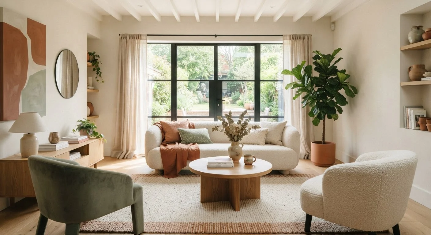
The Basics: Hue, Value, and Saturation
Every colour decision in a room comes down to three properties working together. Hue is the colour itself — red, blue, yellow — as it appears on the colour wheel. Value describes how light or dark a colour is, regardless of the hue. Saturation (also called chroma) measures intensity: a highly saturated red is vivid and bold; a low-saturation red reads as a dusty or muted rose.
These three properties determine not just what colour you're looking at, but how much visual weight it carries. A deep navy at high saturation will anchor a room completely differently than a pale, desaturated version of the same blue. Understanding this distinction lets you make far more precise choices than simply picking a colour family.
For a grounding in the broader vocabulary designers use when talking about these properties, the Language of Interior Design glossary is a useful reference to keep nearby.
Test Paint Samples at Scale
Small paint chips are notoriously misleading. A colour that looks soft and pale on a 2-inch chip can read as intense on a full wall. Paint a 12-by-12-inch or larger swatch directly on the wall and observe it across morning, afternoon, and evening. This step alone prevents the most common and costly colour mistakes.
Warm vs. Cool: How Temperature Shapes Perception
Colours are loosely grouped into warm (reds, oranges, yellows) and cool (blues, greens, violets) families. This temperature distinction has a measurable effect on how we experience a space.
Warm colours visually advance — they appear to move toward the viewer, which makes walls feel closer and a room feel more enclosed, intimate, and energetic. This effect makes them a natural fit for dining rooms, living spaces meant for socialising, or any area where you want to encourage warmth and connection.
Cool colours visually recede — they appear to push surfaces back, lending a sense of openness, calm, and spaciousness. Bedrooms and bathrooms frequently benefit from cool palettes for exactly this reason. If spatial illusions interest you, our piece on why small rooms feel even smaller goes deeper into how colour and layout work together.
~90%
Of snap judgments about products attributed to colour alone
Research published in the journal Management Decision suggests colour accounts for up to 90% of initial product assessments, underscoring how powerfully hue shapes first impressions in designed spaces too.
60-30-10
Classic colour proportion rule used by interior designers
The 60-30-10 ratio — dominant, secondary, and accent colour — is a widely taught starting framework in professional interior design education for building balanced room palettes.
Contrast and Value: The Architecture of a Colour Scheme
While hue and temperature get most of the attention, value contrast is arguably what shapes a room most powerfully. High contrast — pairing a very dark tone with a very light one — creates definition, drama, and visual energy. Low contrast — staying within a narrow range of light or dark values — produces a more seamless, restful effect.
Think of a white room with bright white walls, pale wood floors, and ivory soft furnishings: without contrast, the room reads as quiet and airy, but can also feel flat. Introduce a deep-toned sofa or a dark-framed window and the space gains immediate structure. Contrast also determines legibility: architectural details like trim, crown moulding, and cabinetry read more or less prominently depending on how much their value differs from the surrounding wall.
Pairing colour choices with thoughtful texture layering deepens the effect considerably — our guide on texture in interior design explores how matte and reflective surfaces amplify or soften colour.
Applying Colour Theory Room by Room
Knowing the theory is most useful when it guides room-specific decisions. Here's how to think about it practically:
- Living rooms: A split-complementary or analogous palette (colours that sit adjacent on the colour wheel) creates harmony without monotony. Define a dominant hue for large surfaces, then use the 30% secondary and 10% accent proportions for furnishings and décor.
- Bedrooms: Lower saturation and cool-to-neutral hues support rest. Value contrast can come from bedding and textiles rather than wall paint if you prefer a softer boundary.
- Kitchens: Warm mid-tones or clean whites tend to work well under the mixed lighting typical in kitchens. Undertone consistency matters here — a warm-white cabinet next to a cool-white tile will create unintended contrast.
- Small or dark rooms: Lighter values and lower saturation open a room optically; the relationship between colour and lighting deserves careful planning, which our article on natural light vs. artificial lighting addresses in detail.
Undertones and the Light-Source Effect
One of the most common frustrations homeowners face is selecting a paint colour from a chip that looks perfect in the store, only to find it looks completely different on the wall. The culprit is almost always the interplay between the colour's undertone and the room's light source.
Every paint colour — including whites and neutrals — contains secondary undertones of pink, green, yellow, purple, or blue. Those undertones become more visible under certain light conditions. A white with a green undertone can read as clinical under daylight but mellow under warm incandescent light. The fix is simple: paint large test patches directly on the wall and observe them at different times of day and under artificial lighting before committing.
Colour Shifts Under Different Bulb Types
Incandescent and warm LED bulbs (colour temperatures around 2700K) enhance warm tones and suppress cool ones. Daylight or cool-white LEDs (5000K and above) do the reverse. If your room uses a mix of bulb types — say, warm pendants and cool under-cabinet lighting — test paint under both to see the full range of how it will appear.
Undertone awareness also connects to personal style decisions — the same logic applies when finding a personal colour palette for clothing, where skin undertones interact with fabric hues in comparable ways.