Why a Personal Colour Palette Is Worth Having
Colour is one of the most immediate signals in personal style — but it's also one of the most misunderstood. Many people default to black and neutrals out of uncertainty rather than preference, or accumulate a wardrobe full of unrelated colours that don't work together. A personal palette solves both problems at once.
The goal isn't to restrict what you wear. It's to give you a reliable set of colours that consistently look intentional on you — so that getting dressed takes less effort and your wardrobe builds on itself rather than fragmenting. If you're also thinking about how colour works in your living spaces, the same foundational principles apply: see our colour theory guide for interiors for how hue, tone, and contrast interact in a room.
Undertone Is Not the Same as Skin Tone
Skin tone describes depth — how light or deep your complexion is. Undertone describes the underlying hue running beneath the surface: warm (yellow, peachy, golden), cool (pink, red, bluish), or neutral (a mix of both). Two people with the same skin tone can have completely different undertones, and it's undertone that most directly determines which colours feel harmonious near your face.
A palette also doesn't need to be permanent. As your style evolves — or as you move through different life phases — revisiting and adjusting it is normal. Think of it as a working reference, not a fixed identity.
What You'll Need Before You Start
This process doesn't require a professional colour analyst or a special tool. What it does require is good light and a range of colours to test against your skin.
What you will need
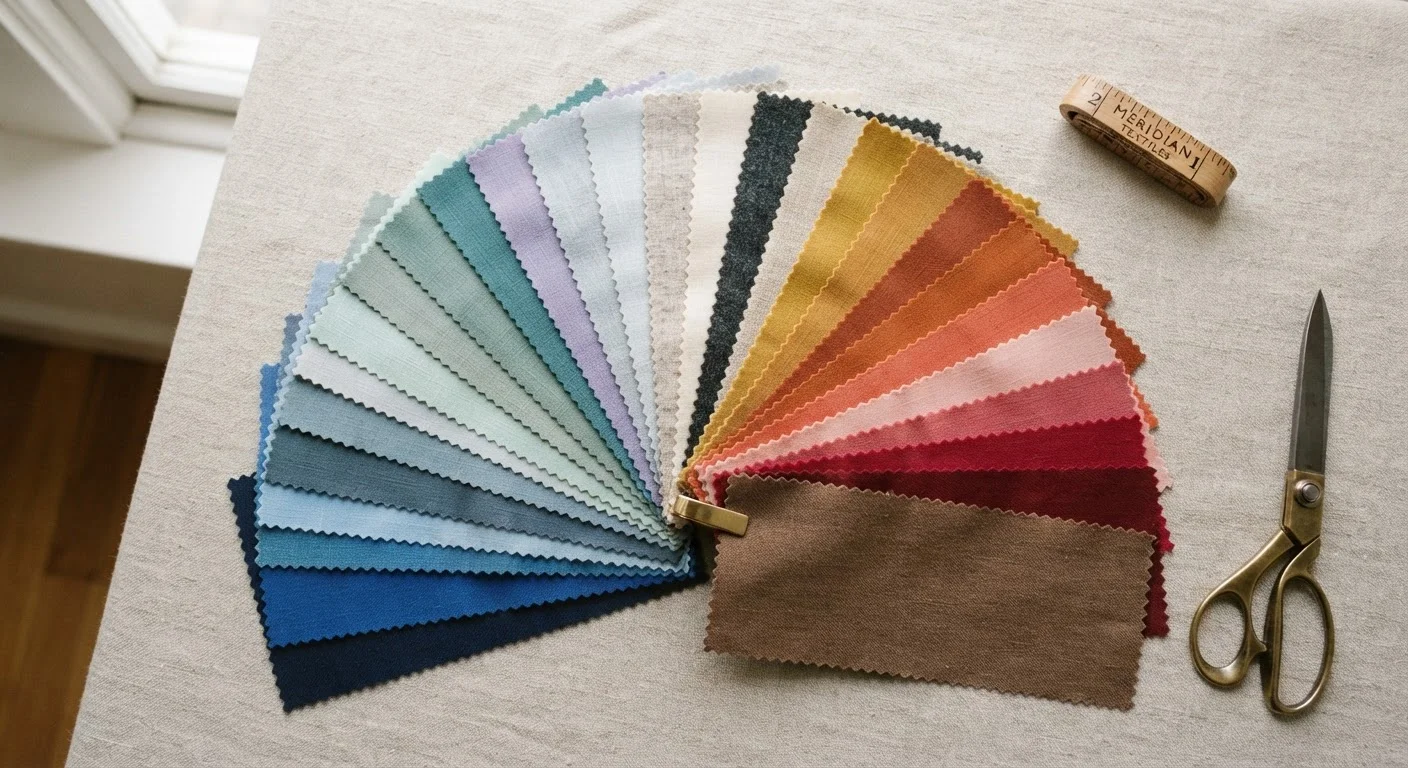
Fabric swatches or scarves
Held near the face to observe how different hues interact with your complexion in real time.
Natural-light mirror setup
Ensures accurate colour perception without the distortion of warm or cool artificial bulbs.
Smartphone camera
Photos reveal undertone clashes more objectively than a live mirror, since eyes adjust quickly.
Colour wheel reference
Helps you understand warm versus cool hue families when building a cohesive palette.
Set aside around 20 to 45 minutes in a space with good natural light. Do this when you're not wearing heavy makeup, or at least go bare-faced or with minimal base coverage — foundation and concealer alter how colour reads against your skin.
How to Find Your Colours: Step by Step
Test Colours in Natural Light
Artificial lighting — especially fluorescent — distorts how colours read against your skin. When doing any colour test, move to a window with indirect natural light. This simple shift makes it much easier to see whether a shade adds warmth and life to your face or pulls it flat.
Identify your skin undertone
Before reaching for swatches, narrow down your undertone. Three quick self-tests help:
- Vein test: Look at the inside of your wrist in natural light. Blue-purple veins suggest a cool undertone; green-tinted veins point to warm. A mix indicates neutral.
- Jewellery test: Recall which metal tends to earn you compliments. Silver flatters cool undertones; gold suits warm; both work for neutral.
- White vs. off-white test: Hold a bright white fabric next to your face, then swap it for a cream. Whichever makes your skin look more even and alive signals your undertone direction.
You don't need all three tests to agree perfectly — look for the consistent lean.
Gather swatches across the colour spectrum
Pull together fabrics, scarves, or even folded garments in a range of hues: at least one warm tone (rust, olive, golden yellow, peach), one cool tone (cobalt, lavender, fuchsia, icy blue), and one neutral (camel, slate, off-white, charcoal). Solid, matte fabrics work better than patterned or shiny ones, which introduce too many variables.
You don't need to buy anything — raid your own wardrobe, a friend's, or pick up inexpensive fabric remnants from a craft store.
Drape and observe in natural light
Wearing a neutral top (or draping a grey or white cloth over your shoulders to neutralise your clothing), hold each swatch under your chin and look in your mirror near a natural light source. Observe:
- Does the colour make your skin look even, clear, and alive — or does it cast a shadow, add a grey cast, or make blemishes more visible?
- Do your eyes appear brighter or duller?
- Does the overall effect feel harmonious, or does your face seem to recede behind the colour?
Take a quick photo with each swatch — reviewing images side by side is often more revealing than a live mirror, where your eyes adapt too quickly to notice contrast shifts.
Sort your findings and identify patterns
Separate your swatches into two groups: those that passed (they made your complexion look even and your features more defined) and those that didn't. Look for patterns rather than specific shades:
- Did warm earthy hues consistently perform well?
- Did cooler jewel tones tend to lift your features?
- Were muted, dusty tones more flattering than bright, saturated ones — or vice versa?
These patterns are more useful than any single colour. They form the logic of your palette and make shopping or getting dressed far more intuitive over time. For a broader framework on how aesthetic preferences connect to a defined personal style, see our guide to style archetypes.
Factor in personal preference and context
Flattery is one input — but it isn't the only one. A colour that technically harmonises with your undertone but that you dislike wearing won't serve you. Ask yourself:
- Which colours make you feel confident when you wear them?
- Are there shades you reach for instinctively, even if you've been told they "don't suit" you?
- What contexts will this palette cover — work, casual, evening?
A functional personal palette typically anchors around three to five core colours that you can mix across most outfits. It also helps to consider where colour shows up beyond clothing. The same warm-versus-cool logic applies to makeup: matching concealer undertones to your skin follows an identical principle.
Once you've worked through these steps, you'll have a short list of colour patterns that form the backbone of a palette. From there, it's a matter of applying that knowledge consistently — both in clothing and beyond. If you're building out a makeup kit and want colour-aligned choices, our first makeup kit guide covers how to choose versatile essentials that work across your look.
Avoid Overcomplicating the System
Colour analysis frameworks can be useful starting points, but rigid seasonal typing ("you are a Winter, therefore you can only wear these shades") is a simplification. Real skin tones are complex and individual. Use any system as a loose guide, not a rulebook, and always trust what you see in the mirror over what a category tells you.
Putting Your Palette to Work
Once you have your core colours, the practical step is integrating them into your existing wardrobe rather than starting over. Audit what you already own: pull out the pieces in your identified palette colours and note what's missing in terms of category (a warm-toned top, a cool-toned layer). This gives you a focused direction for any future additions.
Colour confidence often builds gradually. If you're new to wearing colour intentionally, wearing palette colours closest to your face — scarves, tops, necklines — tends to have the greatest visual impact. For readers ready to push further, our article on wearing colour confidently explores the trade-offs of a more colour-forward wardrobe. And if budget is a consideration, a focused palette actually makes a limited wardrobe go further — something covered in our piece on personal style on a limited budget.